
Why Your Dashboard Feels Busy: A Simple CRM and Admin Panel UX Framework
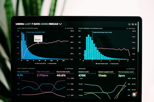
A dashboard is not a place to show everything. It is a place to help someone make the next right decision.
That is why many CRM and admin panels fail. They include charts, cards, tables, filters, sidebars, alerts, and colors, but the user still has to ask, “What should I do now?”
Skymark’s OutloudHub case study points toward a useful principle: make data visual before it becomes textual. That matters. But good dashboard UX goes deeper than adding charts.
First, Define The Job
Every dashboard should have a job. Not a feature list. A job.
For a sales CRM, the job may be: “Show which leads need follow-up today.”
For a team management system, it may be: “Show attendance, workload, blockers, and overdue tasks.”
For a campaign dashboard, it may be: “Show which campaign is wasting budget and which one is scaling.”
If the job is unclear, the dashboard becomes a storage room for data.
Layers
The 5-Layer Dashboard Framework
1. Priority layer
The top area should answer the most important question first. Revenue, open tasks, pending approvals, urgent alerts, or today’s workload. Do not make users hunt.
2. Status layer
Use simple visual signals: on track, needs attention, blocked, completed. Color should support meaning, not decorate the screen.
3. Action layer
Every important insight needs an action. If a lead is overdue, show “follow-up.” If inventory is low, show “reorder.” If a ticket is stuck, show “assign.”
4. Detail layer
Tables and records are still important, but they should sit after the summary. Let users drill down when they need evidence.
5. Learning layer
The system should help teams improve over time. Show trends, bottlenecks, and repeated issues, not just today’s numbers.
Why Left Navigation Often Works Better
For complex tools, a left sidebar usually scales better than a top menu. It keeps sections visible, supports more modules, and helps users understand where they are. This matches Nielsen Norman Group’s “recognition rather than recall” heuristic: people should not have to remember where important actions live.
The Hidden Cost Of Bad Dashboard UX
Bad dashboards do not only look messy. They create real business costs.
Managers spend more time asking for updates. Team members miss priority changes. Clients wait longer. Reports get exported manually. Decisions happen late. Eventually, people stop trusting the system and return to spreadsheets.
That is the danger: software exists, but the workflow still leaks time.
How To Audit Your Dashboard
Ask five questions:
Can a new user understand the main status in 10 seconds?
Are the most urgent actions visible without scrolling?
Are charts connected to decisions?
Can users recover from mistakes?
Does the dashboard reduce meetings, messages, or manual reports?
If the answer is no, the dashboard is not finished. It is only assembled.
The Better Goal
The best admin panels feel calm. They do not shout. They show the right thing at the right time, then let the user act.
A dashboard should make work lighter, not make people feel like they need another dashboard to understand the dashboard.
Need a CRM, admin panel, or SaaS dashboard that your team will actually use? Skymark Dev designs workflows around real decisions, not empty charts.
Why so much value with a 100% guarantee? Because choosing the wrong partner can cost you. Don’t miss out—secure your brand’s future today. Why so much value with a 100% guarantee? Because choosing the wrong partner can cost you. Don’t miss out—secure your brand’s future today.


Need a CRM, admin panel, or SaaS dashboard that your team will actually use? Skymark Dev designs workflows around real decisions, not empty charts.