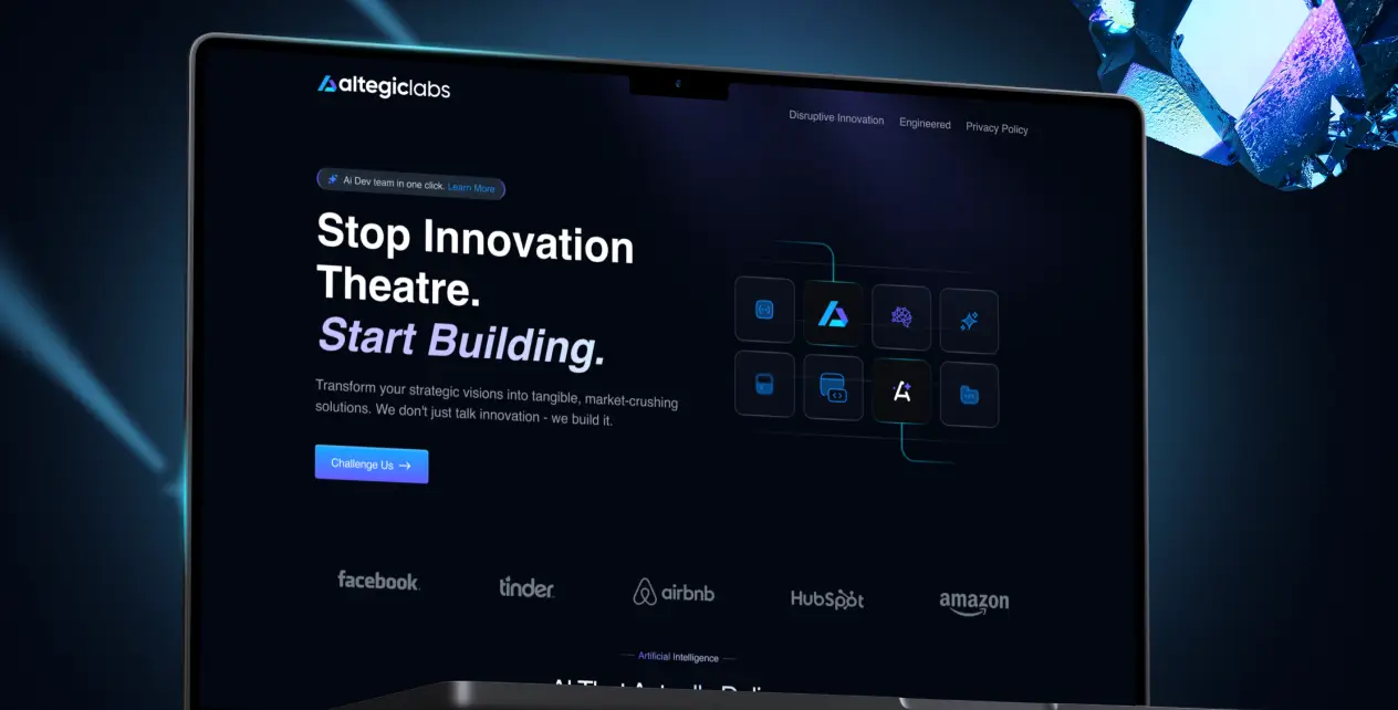
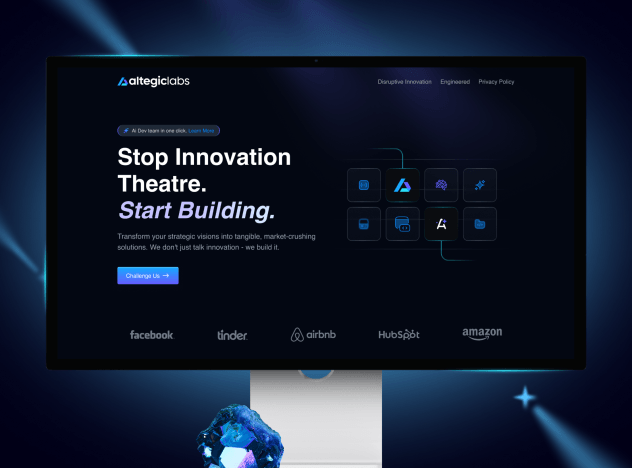
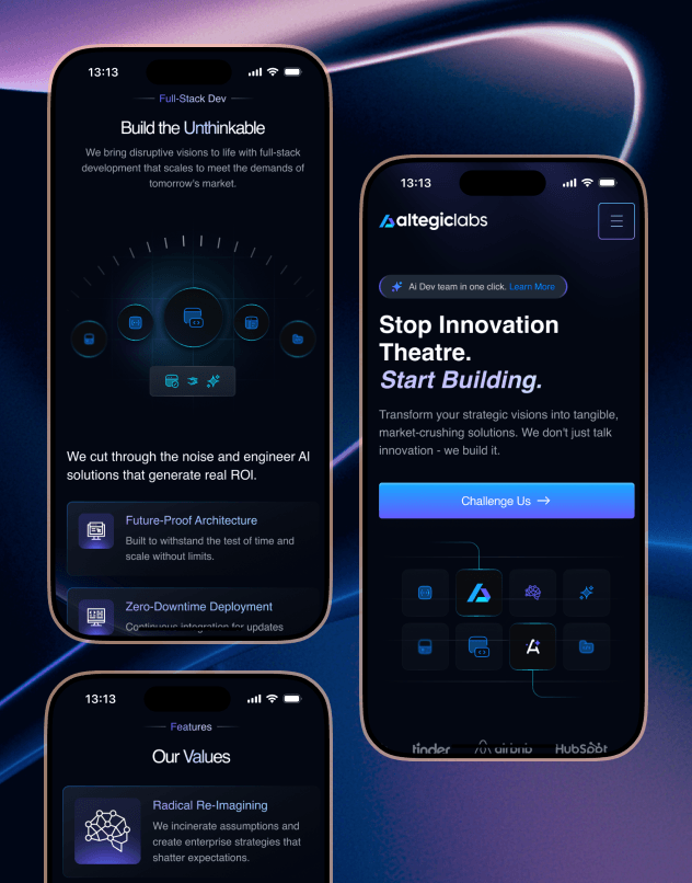
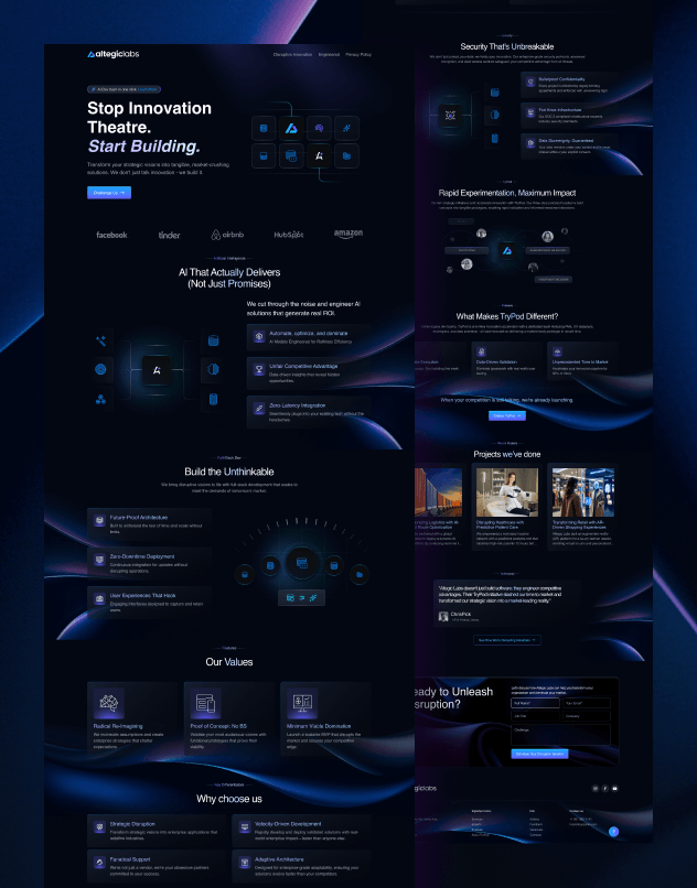
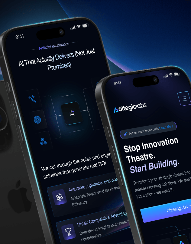
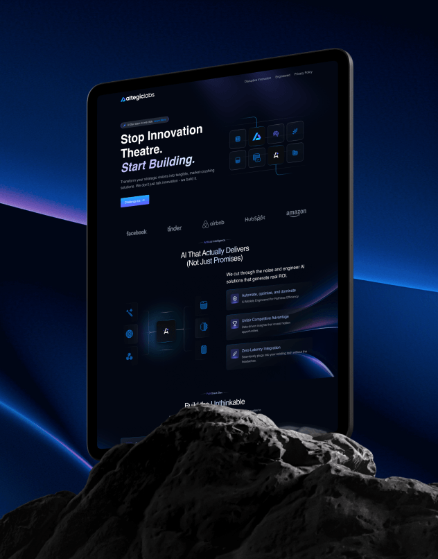
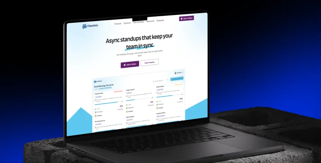
We chose a dark UI — on purpose. Users were spending long hours inside the platform. A dark interface reduces eye strain during extended sessions, and it also pushes data visualizations — charts, graphs, and numbers — to visually pop without extra styling effort. Less distraction, more focus on what matters.